Architecture Website 2025
Atrium Studio
An architecture practice whose old site made their buildings look small. We gave the photographs the whole screen and got out of the way.
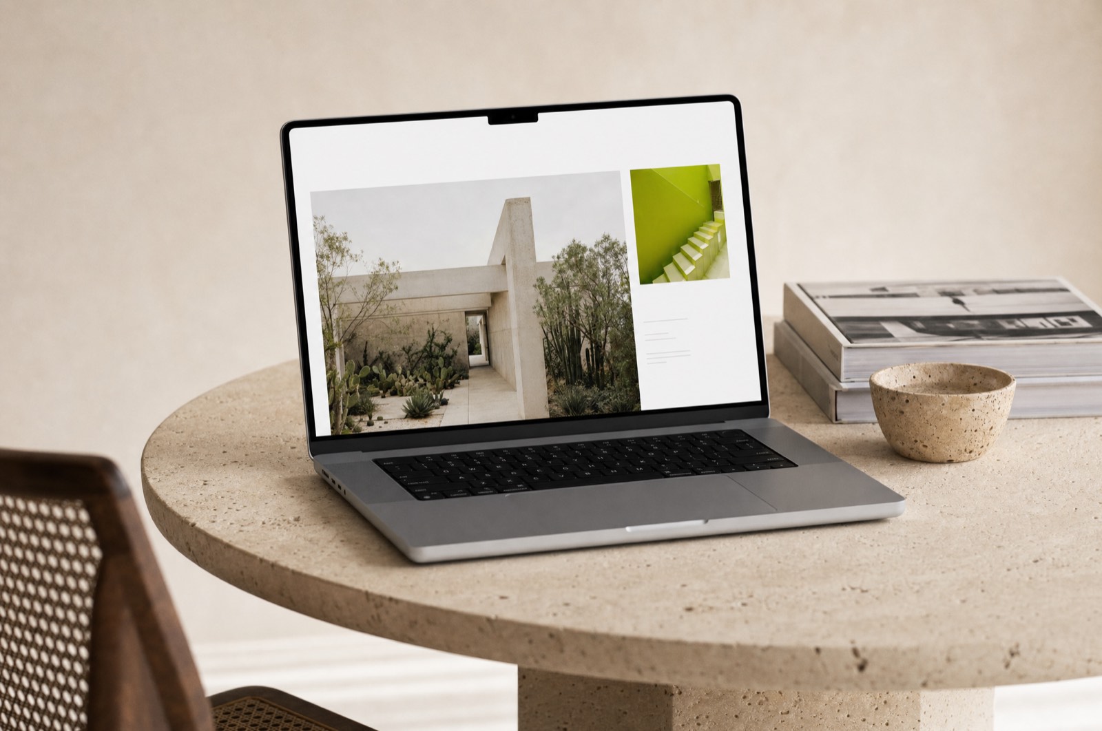
Atrium's photography is extraordinary and their old website showed it at 380 pixels wide inside a card with a drop shadow. That was the entire diagnosis. It took ten minutes and the rest of the project was carrying it out properly.
One decision, held
Every image runs to the edge of the viewport. No cards, no frames, no shadows, no rounded corners on anything that contains a photograph. The interface is a thin layer of type that appears when you need it and recedes when you do not.
Holding that meant saying no to a lot of reasonable requests. A filter bar. A related-projects grid. A newsletter block over the imagery. Each one was defensible on its own and each one would have re-introduced the frame we had just removed.
Making it fast anyway
Full-bleed photography is the easiest way to build a slow website. Every image ships in three sizes as AVIF with a JPEG fallback, decoded off the main thread, with the first viewport's image preloaded and everything below it deferred. The project pages weigh less than the old card grid did.
Writing the captions
The other half of the job was text. Architecture sites tend toward the abstract — a dialogue between volume and light. We replaced all of it with facts: where it is, what it was before, how many people use it, what it is made of. It reads better and it ranks better, which was not the point but was not unwelcome either.
Our work finally looks the size it is.
More work
Got something you want made properly?
Tell me what it is, when it needs to exist, and what you have tried already. I answer every email within two days, including the ones I have to say no to.
Currently booking from March 2026.